“Me & We”
Cross-Platform utility to help people learn about being a first-time parent
Project overview
The product:
Me & We is an App for First time parents focused on
providing all the necessary information and advice a
new parent is looking for. Me & We app’s primary
target users include women as well as men who need
advice and information for their new phase of life as a
First time parent.
Project duration:
February 2022 to March 2022
The problem:
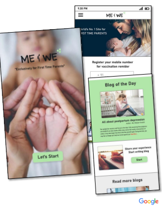
As a first time parent everyone has lots of questions in mind related to the new life and the babies. Most of the time due to busy schedule parents do forget baby’s vaccination Date.
The goal:
Me & We App will provide all the required information a First time parent is looking for. Apps Vaccinations Reminder feature make its unique from other app in the market. Also “consult doctors online” and “read and write blog” option interest users.
My role:
UX designer leading the app and responsive website design from conception to delivery
Responsibilities:
Conducting interviews, paper and digital wireframing, low and high-fidelity prototyping, conducting usability studies, accounting for accessibility, iterating on designs, determining information architecture, and responsive design.
Understanding the user
- User research
- Personas
- Problem statements
- Competitive audit
- Ideation
User research: summary
I met first time parents to gather details so that I could develop interview questions, which were then used to conduct user interviews. Most interview participants reported feeling bad when they forget or missed their child vaccination. The feedback received through research made it very clear that users want to have an app which gives them vaccination reminder and a platform where they can share their experience as a first time parents and get some useful information related to this.
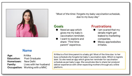
Persona 1: Kritika
Problem statement:
Kritika is a First-time parent to a baby girl who needs an app that gives her reminder for vaccination schedule as per the baby’s age.
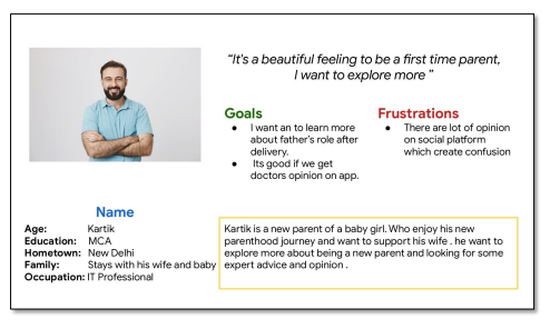
Persona 2: Kartik
Problem statement:
Kartik is a first-time parent to a baby girl who needs an app through which he can get some expert advice and opinion.
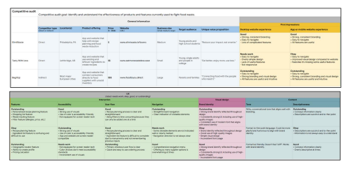
Competitive audit
An audit of a few competitor’s products provided direction on gaps and opportunities to address with the First time parent app.
Ideation:
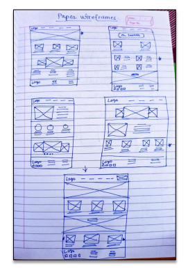
I did a quick ideation exercise to come up with ideas for how to address gaps identified in the competitive audit. My focus was specifically on the Vaccination reminder feature.
Start the design
- Digital wireframes
- Low-fidelity prototype
- Usability studies
Digital wireframes
Low-fidelity prototype
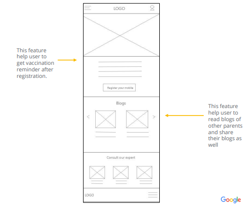
After ideating and drafting some paper wireframes, I created the initial designs for the “Me & We” app. These designs focus on delivering personalized guidance to users to get vaccination reminders and expert advice.
Low-fidelity prototype
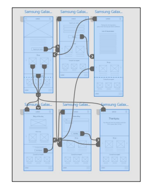
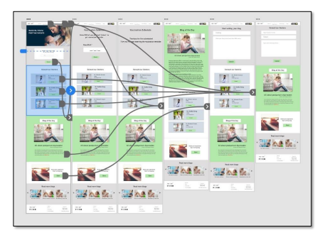
To prepare for usability testing, I created a low-fidelity prototype that connected the user flow of viewing Vaccination reminder feature, consult a doctor with read and write blog feaures.
Usability study: parameters
Study type:
Unmoderated usability study
Participants:
5 participants
Participants:
2 participants
Location:
New Delhi, India
Length:
20-30 minutes
Length:
10–20 minutes
Usability study: findings
Finding
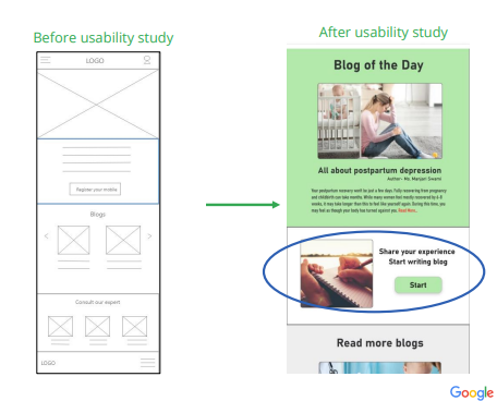
User was not able to find “Start writing blog” button
Finding
User want “Best blogs” to be highlighted on the home page.
Refining the design
- Mockups
- High-fidelity prototype
- Accessibility
Mockups
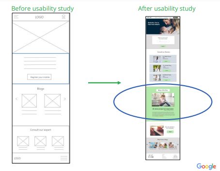
Based on the insights from the usability studies, I applied design changes like Adding Start writing blog button on top of the front page.
Mockups
Based on the insights from the usability studies, I applied design changes like Adding Start writing blog button on top of the front page.
Mockups
High-fidelity prototype
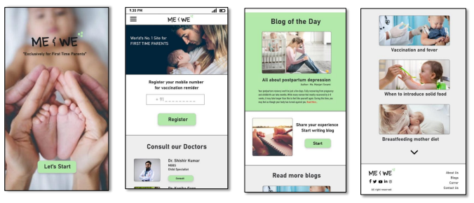
The high-fidelity prototype followed the same user flow as the low-fidelity
prototype, including design changes made after the usability study.
Responsive Design
- Information architecture
- Responsive design
Sitemap
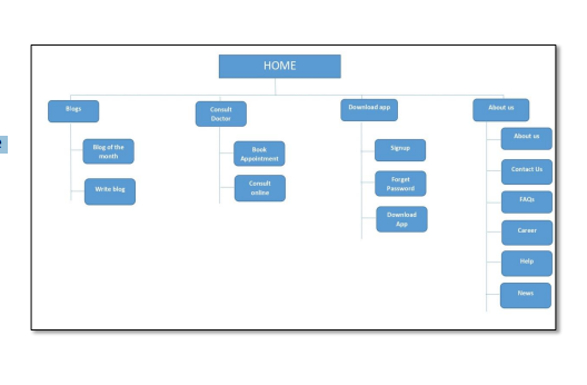
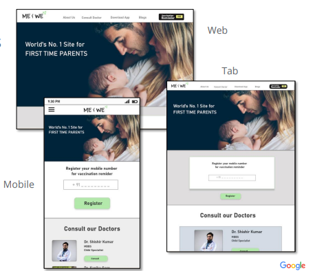
With the app designs completed, I started work on designing the responsive website. I used the “Me & We” sitemap to guide the organizational structure of each screen’s design to ensure a cohesive and consistent experience across devices.
Responsive designs
The designs for screen size variation included mobile, tablet, and desktop. I
optimized the designs to fit specific user needs of each device and screen size.
Going forward
- Takeaways
- Next steps
Takeaways
Impact:
Users shared that the app gives you vaccination reminder before and on time. One quote from user during usability study was that “The Me & We app helps making life of a First time parent so smooth and provide all the necessary information on one click”
What I learned:
I learned that even though the problem I was trying to solve was a big one, diligently going through each step of the design process and aligning with specific user needs helped me come up with solutions that were both feasible and useful.
Next steps
Conduct research on how
successful the app is in
reaching the goal to set a
reminder for vaccination.
Add more educational
resources for users to
learn about being first
time parent.
Give platform to user for
not only read blogs but to
share your personal
expereinces through
blogs as well.
Let’s connect!
Thank you for your time reviewing my work on the Me & We app! If you’d like to see more or would
like to get in touch, my contact information is provided below.
Email: ramatiwari17@gmail.com
Website: www.ramadubey.com

I am a Communication Professional with more than 13 years of rich experience in Public relations, Media management, Marketing and Brand promotion. Currently working as a Head- communication for an IT firm.


About The Author
Rama Dubey
I am a Communication Professional with more than 13 years of rich experience in Public relations, Media management, Marketing and Brand promotion. Currently working as a Head- communication for an IT firm.