Food Villa
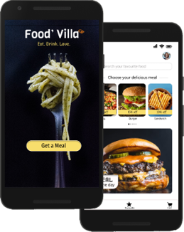
Food menu app for “Food Villa” cafe
Project overview
The product:
“Food Villa” is a Café located in New Delhi. “Food Villa” Strives to deliver healthily and variety of food and drinks. Their target audiences are youngsters and people who lack the time or ability to prepare food.
Project duration:
September 2021- January 2022
The problem:
Youngsters and people lack the time or ability to prepare food.
The goal:
Design an App that allows users to order healthy and variety of food online.
My role:
I design the app from conception to delivery.
Responsibilities:
Conducting interviews, paper and digital wireframing, low and high –fidelity prototyping, conducting usability studies, accounting for accessibility and iterating on designs
Understanding The User
- User research
- Personas
- Problem statements
- User journey maps
User Research: Summary
I had created a user journey map of Ashish’s experience using the site to help identify possible pain points and improvement opportunities.
I conducted interviews and created empathy maps to understand the users I’m designing for and their needs . A primary user group identified through research was youngsters and working adults who don’t have time to cook meals.
Research revealed that due to lack of time many people are not able to cook food at home , other user problems included high prices, less variety in food and no option to customized their food.
User Research: Pain Points
Time
Working adults are too busy
to spend time on meal prep
High Cost/Price
People want reasonable price for food.
Customized Food
People want an option to customize their food as per their requirements.
Variety
Everyone wants variety in food to choose from.
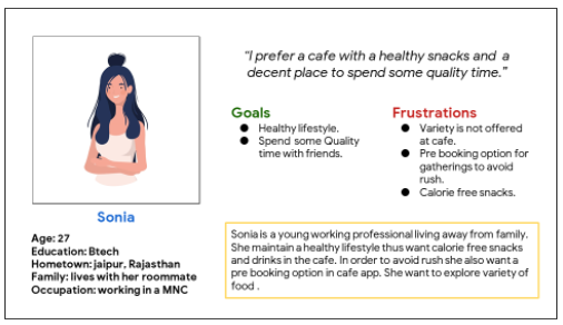
Persona: Sonia
Problem statement:
Sonia is a college student, who doesn’t have enough time to prepare food. She needs healthy food at a low price with a good amount of variety food.
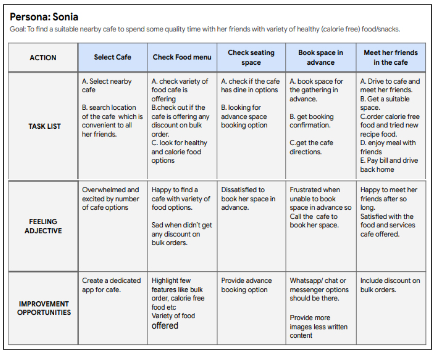
User journey map
Mapping Sonia’s user journey revealed how helpful it would be for users to have access to a dedicated app.
Starting the design
- Paper wireframes
- Digital wireframes
- Low-fidelity prototype
- Usability studies
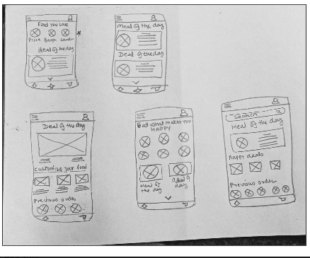
Paper wireframes
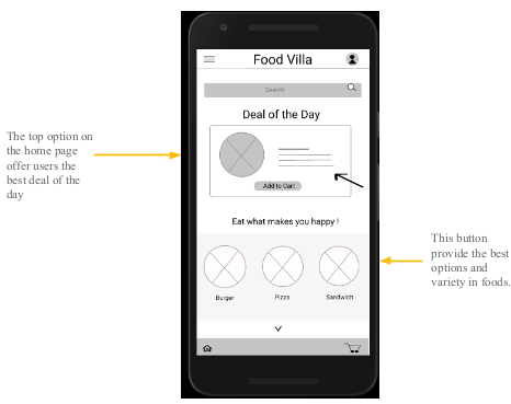
For the home screen, I chose to highlight top deals and variety of food, which attracts the users the most.
Digital wireframes
As the initial design phase continued, I made sure to base screen design on feedback and findings from the user research.
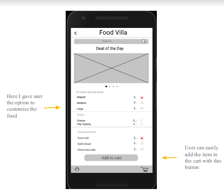
User can easily customize the food and can easily add it to the cart to complete the checkout process.
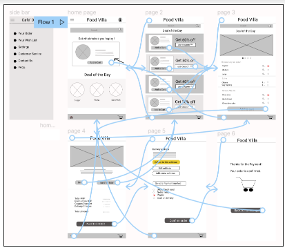
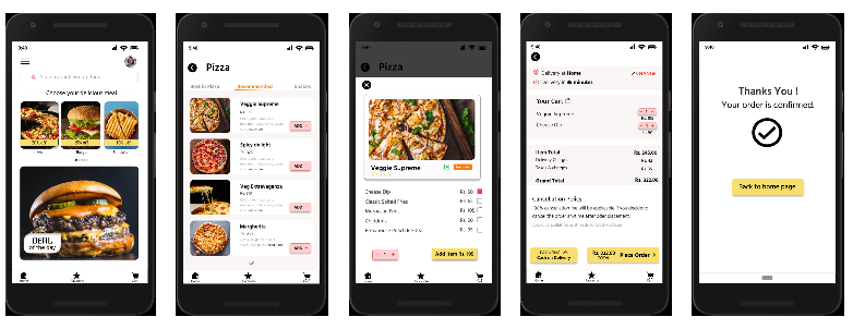
Low-fidelity prototype
The low- fidelity prototype connected the
primary user flow of building and ordering
food, so the prototype could be used in a
usability study with users.
Link to the lo-fi prototype
Lo-fi prototype
Usability study: findings
I conducted two rounds of usability studies. Findings from the first study helped guide the designs from wireframes to mockups. The second study used a high fidelity prototype and revealed what aspects of the mockups needed refining.
Round 1 findings
Users want good discount and deals
Users want more customization options
User want to know the ingredients of the
food
Round 2 findings
User want more options to save/edit address
Refining the design
- Mockups
- High-fidelity prototype
- Accessibility
Mockups
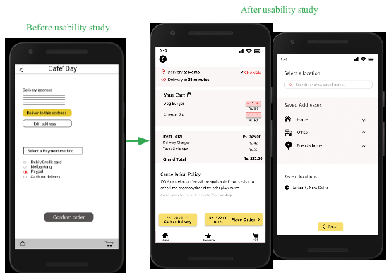
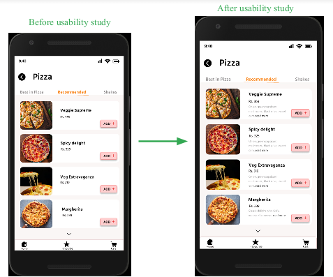
[In the food villa app there was only one option to choose the delivery address and also to edit the same address but after the usability study it was observed that user want to save and choose more delivery addresses like home/office/friend home
etc ]
Mockups
The second usability study revealed that users also wants to know the key
ingredients of the food. So I added the key ingredients of the food in a short
description below the pricing of the food.
Mockups
High-fidelity prototype
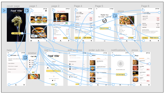
The Final high-fidelity prototype presented cleaner user flows to order food. It also meets user needs to customize their food with some exciting deals.
Link hi-fi prototype:
High fidelity prototype
Usability study: findings
Round 1 findings
Users want good discount and deals
Users want more customization option
User want to know the ingredients of the food
Round 2 findings
User want more options to save/edit address
Going forward
- Takeaways
- Next steps
Takeaways
Impact:
The app makes users feel like Food Villa’s app really think about its users by giving them exciting deals, a list of ingredients, and options to customize their food.
One quote from peer feedback:
Great use of the design principles! The content looks like something I’d see on a real ordering app!
What I learned:
While designing the Food Villa app, I learned that usability study and peer feedback improves the design and gives the designer a clear idea about the user’s expectation.
Next steps
Conduct another round of usability studies to validate whether the pain points users experienced have been effectively addressed.
Conduct more user research to determine any new areas of need.
Let’s connect!
Thankyou for your time for reviewing my work on the FOOD VILLA app! If you’d like to see more or
get in touch, my contact information is provided below.
Email: ramatiwari17@gmail.com
Website: www.ramadubey.com

I am a Communication Professional with more than 13 years of rich experience in Public relations, Media management, Marketing and Brand promotion. Currently working as a Head- communication for an IT firm.




About The Author
Rama Dubey
I am a Communication Professional with more than 13 years of rich experience in Public relations, Media management, Marketing and Brand promotion. Currently working as a Head- communication for an IT firm.