Homely
Website for finding rental homes
Project overview
The product:
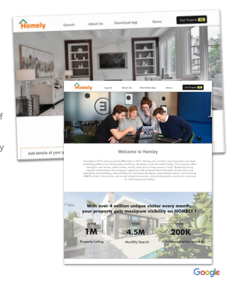
Homely is a website to sell/buy or rent home that offer to post your advertisement on the site at free of cost. The typical user is between 20-40 years old. Homely’s goal is to make home search fast, and easy for all types of users.
Project duration:
24 January 2022- 28 February 2022
The problem:
Available online housing websites have cluttered designs, inefficient systems for searching suitable options, and confusing processes.
The goal:
Design a housing website to be user-friendly by providing clear navigation and offering a free advt post option.
My role:
UX designer leading the Homley website design
Responsibilities:
Conducting interviews, paper and digital wireframing, low and high-fidelity prototyping, conducting usability studies, accounting for accessibility, iterating on designs, and responsive design.
Understanding the user
- User research
- Personas
- Problem statements
- User journey maps
User research: summary
I conducted user interviews, which I then turned into empathy maps to better understand the target user and their needs. I discovered that many target users want to post their own requirement advt. However many housing website are not offering to post any requirement and confusing to navigate and search options, which frustrated many target users. This caused a normal experience to become challenging for them, defeating the purpose to visit the site..
User research: pain points
Housing website designs are often busy, which results in confusing navigation
Small buttons on housing websites make selection difficult, which sometimes leads users to make mistakes
Housing websites don’t provide an engaging browsing experience
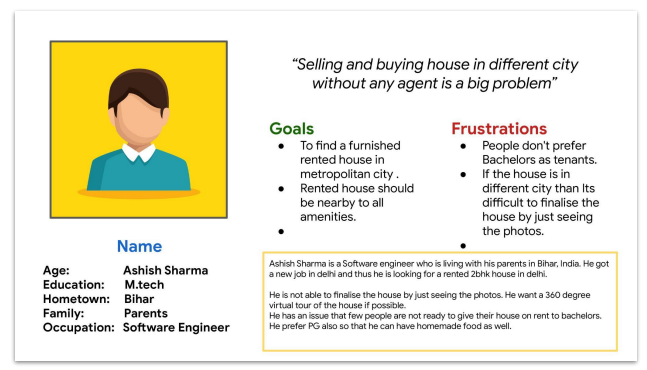
Persona : Ashish Sharma
Problem statement:
Ashish is a busy working professional who needs an intuitive website
navigation and search filters because he wants online house search to be stress-free.
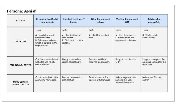
User journey map
I had created a user journey map of Ashish’s experience using the site to help identify possible pain points and improvement opportunities.
Start the design
- Sitemap
- Paper wireframes
- Digital wireframes
- Low-fidelity prototype
- Usability studies
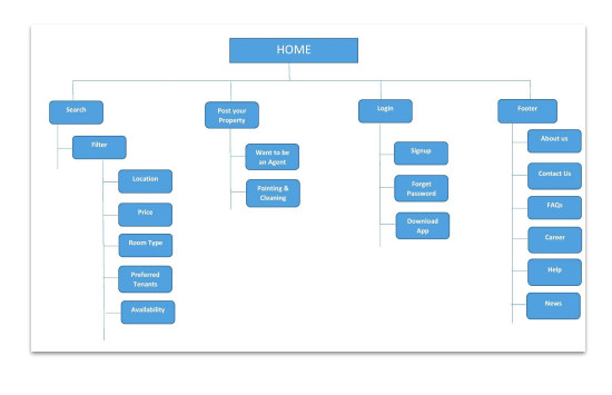
Sitemap
Difficulty with website navigation was a primary pain point for users, so I used that knowledge to create a sitemap. My goal here was to make strategic information architecture decisions that would improve overall website navigation. The structure I chose was designed to make things simple and easy.
Paper wireframes
Next, I sketched out paper wireframes for each screen in my app, keeping the user pain points about navigation, browsing, and checkout flow in mind. The home screen paper wireframe variations to the right focus on
optimizing the browsing experience for users.
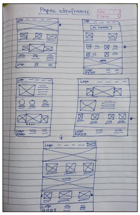
Paper wireframe screen size variation(s)
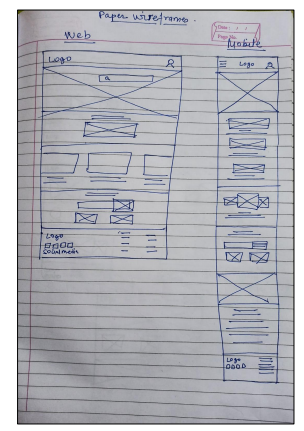
Because Homely customers access the site on a variety of different devices, I started to work on designs for additional screen sizes to make sure the site would be fully responsive.
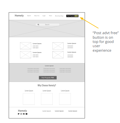
Digital wireframes
Moving from paper to digital wireframes made it easy to understand how the redesign could help address user pain points and improve the user experience. Prioritizing useful button locations and visual element placement on the homepage was a key part of my strategy.
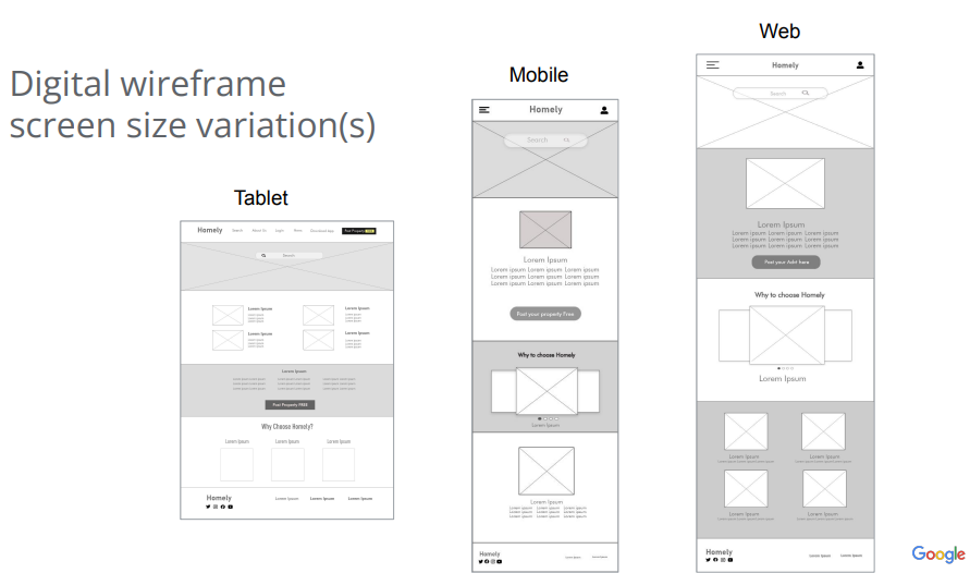
Digital wireframe screen size variation(s)
Moving from paper to digital wireframes made it easy to understand how the redesign could help address user pain points and improve the user experience. Prioritizing useful button locations and visual element placement on the homepage was a key part of my strategy.
Low-fidelity prototype
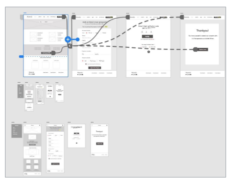
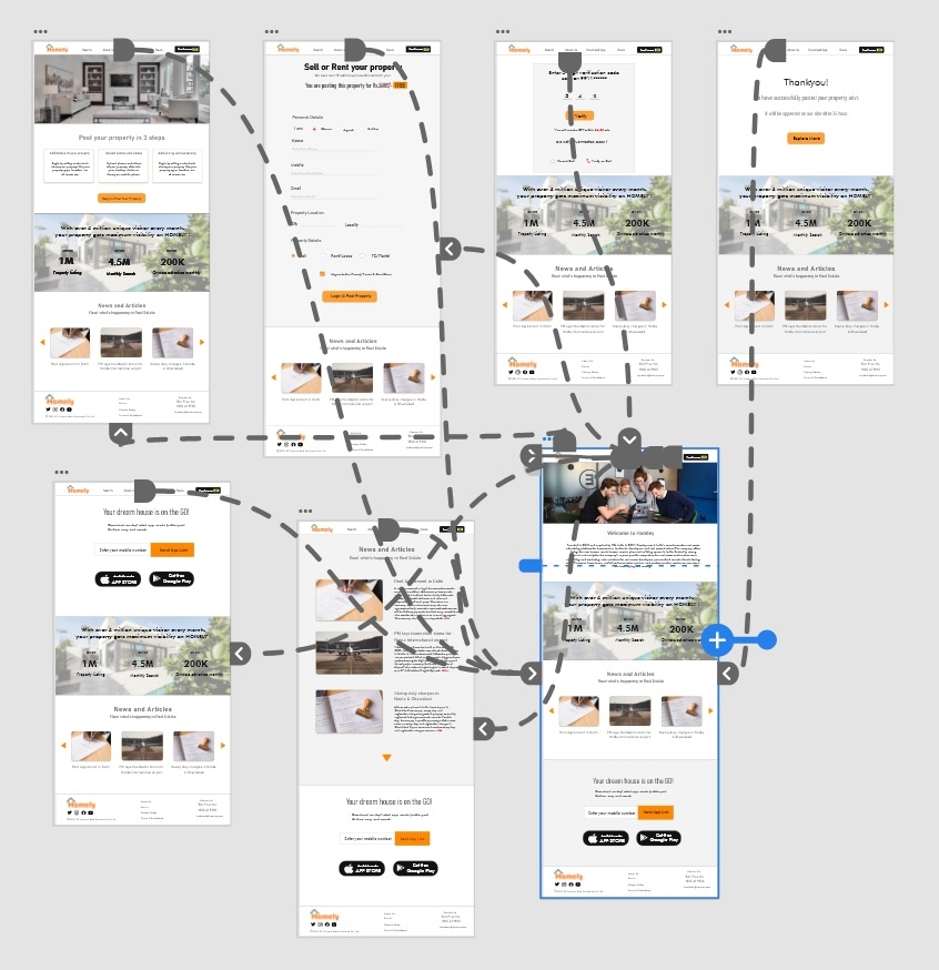
To create a low-fidelity prototype, I connected all of the screens involved in the primary user flow of posting an advertisement.
Usability study: parameters
Study type:
Unmoderated usability study
Participants:
2 participants
Location:
New Delhi, India
Length:
10–20 minutes
Usability study: findings
Finding
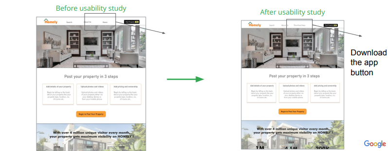
User was not able to find Download app button.
Finding
User want a separate page for news section.
Refining the design
- Mockups
- High-fidelity prototype
- Accessibility
Mockups
Based on the insights from the usability study, I made changes to improve the site’s workflow. One of the changes I made was adding the option to “Download the app” button on top menu bar.
Mockups: Original screen size
Mockups: Screen size variations
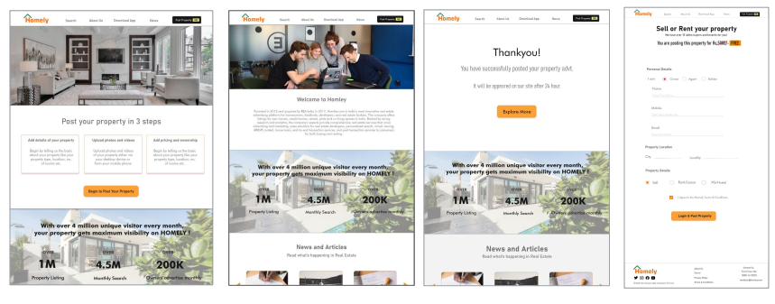
I included considerations for additional screen sizes in my mockups based on my earlier wireframes. Because users login from a variety of devices, I felt it was important to optimize the browsing experience for a range of device sizes, such as web, mobile and tablet so users have the smoothest experience possible.
High-fidelity prototype
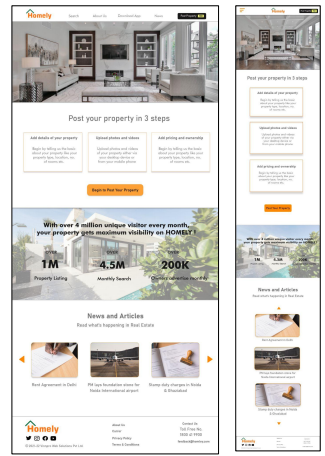
My hi-fi prototype followed the same user flow as the lo-fi prototype, and included the design changes made after the usability study, as well as several changes suggested by peer.
Hi fi Prototype link
Accessibility considerations
1.
I used headings with different sized text for clear visual hierarchy
2.
I have used bold colours for buttons.
Going forward
- Takeaways
- Next steps
Takeaways
Impact:
Our target users shared that the design was intuitive to navigate through, more engaging with the images, and demonstrated a clear visual hierarchy.
What I learned:
I learned that even a small design change can have a huge impact on the user experience. The most important takeaway for me is to always focus on the real needs of the user when coming up with design ideas and solutions.
Next steps
Conduct follow-up usability testing on the new website
Identify any additional areas of need and ideate on new features
Let’s connect!
Thank you for your time reviewing my work on the Homely’s app! If you’d like to see more or would like to get in touch, my contact information is provided below.
Email: ramatiwari17@gmail.com
Website: www.ramadubey.com

I am a Communication Professional with more than 13 years of rich experience in Public relations, Media management, Marketing and Brand promotion. Currently working as a Head- communication for an IT firm.



About The Author
Rama Dubey
I am a Communication Professional with more than 13 years of rich experience in Public relations, Media management, Marketing and Brand promotion. Currently working as a Head- communication for an IT firm.