UX Audit Report
For Vinnpro Web Solutions Pvt. Ltd
Project overview
The product:
Vinnpro is a full-service digital marketing and web development company offering services like digital marketing, SEO, multimedia design, mobile app development, websites, CRM, ERP and many more.
Project duration:
3 weeks
Focus of the study
Discover need and expectation:
To discover the needs and motivation and key expectation from user to improve their website browsing journey
Browsing behavior:
To observe and identify the browsing behavior and painpoints the user encounter during their interaction on website.
Suggestions for website:
To Gather suggestions made by users related to the use of the site and understanding various design elements of the website.
Problem Statement:
Poor or dated visual design, Slow speed, Lack of quality images, Poor or confusing user journey, Low standard of written content, Hidden details or no obvious point of contact, Security issues and certification problems.
My role:
I had conducted usability study, noted study inferences and worked on insights to prepare a top line report.
The goal:
To design an M-site with efficient UI that help the customers to decide and plan in a comprehensible manner.
To provide accurate and sufficient content on each page of the website.
High resolution pictures on gallery.
To add FAQs and blog page to make the website more informative.
Colour contrast of hover effect with logo.
Tools used:

Usability Study Parameters
Study type:
Unmoderated Usability study
Participants
6 users
Location
New Delhi, India
Length
45 Minutes
User Need
Trusted site where they can find and get the desired information.
Case studies and testimonials to build trust on the company
USPs to compare them with other relevant competitors.
Chatboot, active social media sites and relevant contact details.
Measuring User Experience
Method: This document is based on an analysis done using analysis methods such as:
- Usability test
- MoSCoW analysis
- UX NPS
- Competitive analysis.
Usability Test
Discussion framework was prepared to ensure that adequate information is gathered from users.
An individual session consisted of:
- Pre – session interview
- Interview questions
- Feedback on the website
- Post- session debrief
UX NPS Questionnaire
Users rate the following statement from 1 to 10 based on their experience with vinnpro website, where 1 means strongly disagree and 10 means strongly agree:
Navigation : Navigation factor determine how easy it is for user to find what they are looking for in the website.
Discoverability : Discoverability is dependent on the presentation of the information in terms of icons, text and other elements on the site.
Usability : Usability refers to the ease of accessing and understanding the site functionality without any help or reference. It is directly dependent on how easily the user can accomplish various things on site.
Appearance : Appearance is the overall look and feel of the site. It depends on how attractive users find the app.
Credibility : credibility of the app is decided on the basis of how trustworthy users find the app in terms of information and transactions.
Satisfaction : Satisfaction rate is decided on the basis of how useful the app is to the user with respect to their need. also if the user would recommend the app to their companions.

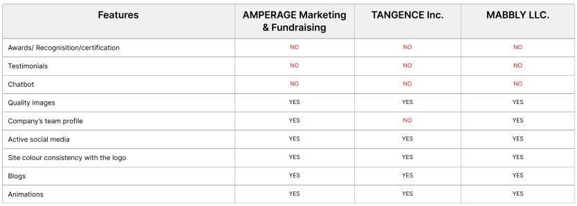
Competitive Analysis
In order to identify the strengths and weaknesses of competitors related to their business and design, competitive analysis has been done for 3 direct competitors.
MoSCoW analysis:
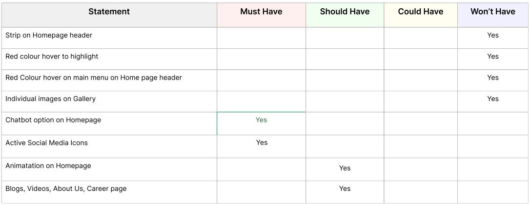
MoSCow analysis was done to segregate insights and opportunities into Must have, Should have, Could have and Won’t have.
Must Have
The absolute must have. There is no way out and there is no shortcut.
Should Have
Essential but not vital.
Could Have
Not a problem if it s left out but still is of significance.
Won’t Have
This is irrelevant. lose it. not only for now, but for good.
Design Experience Insights
1.
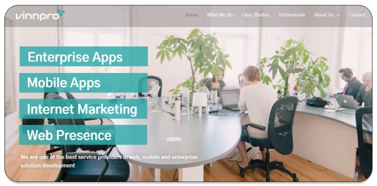
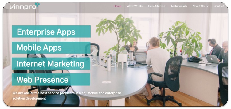
Menu font colour is not in contrast with the top menu strip
2.
Need more case studies for authentication purpose
3.
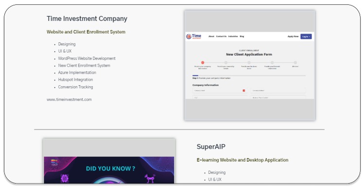
Hover effect is not in contrast with the logo
4.
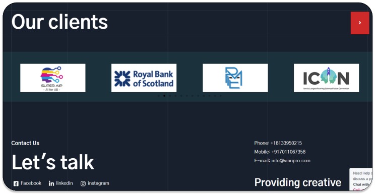
Space between the Dots and client logos are not aligned and slow animation speed of logos.
5.
Images on gallery section are not so impressive.
6.
Blogs, our team, FAQs and career pages can be added.

7.
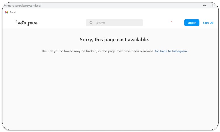
Inactive Social media icon
Next step
Conduct another round of usability studies to validate whether the pain points users experienced have been effectively addressed.
Let’s connect!
Thankyou for your time for reviewing my work! If you’d like to see more or
get in touch, my contact information is provided below.
Email: ramatiwari17@gmail.com
Website: www.ramadubey.com

I am a Communication Professional with more than 13 years of rich experience in Public relations, Media management, Marketing and Brand promotion. Currently working as a Head- communication for an IT firm.


About The Author
Rama Dubey
I am a Communication Professional with more than 13 years of rich experience in Public relations, Media management, Marketing and Brand promotion. Currently working as a Head- communication for an IT firm.